XRP 4-hour TA Shows Possible Slide to 0.20

VOLUME PROFILE SUGGESTS MOVE TO LOWER SUPPORT LEVEL

XRP appears to be preparing to move down a notch to a lower support level, if these indicators are communicating a truthful picture. Let’s take a closer look at the 4-hour chart provided by TradingView, and break down those indicators.

XRP 4-hour TA.png

The biggest clue on the chart is the stochastic. It is clearly rounding off and pivoting, looking like it’s ready to exit the overbought zone that it just barely entered, with the fast line crossing over the slow line and a downward trajectory. Volume is quieting down, which is a confirmation of downward trending.

When we look at the Volume Profile, we see that the next landing spot where heavy institutional trading has taken place is squarely at 0.20. The 0.18 to 0.21 range could be a landing spot for the next consolidation move. With a good clump of volume taking place within this range previously, this will probably act as a magnet on the price line now that we see the indications of the downward movement.

I don’t know what the extent of this correction will be, but at WORST-case, 0.15 is the next lower clump of institutional trading volume that the price line could fall to. I don’t see this as a negative event, IF it does come to fruition. With the overall overwhelming institutional consolidation going on with XRP since 2017, this would simply be another buying opportunity, in my opinion.

Time will tell! I don’t see this as a losing situation. I remain VERY bullish on XRP moving into the fall of 2020.

NOT FINANCIAL ADVICE - Entertainment purposes only. Seek a qualified investment advisor before making any decisions on purchasing cryptocurrencies.

Carlton Flowers
The CryptoPro

MY LINKS:
YouTube Channel - https://www.youtube.com/channel/UCfRbpFKfYxAc9WVUZHwo1NQ
Blog Site - www.carltonzone.com/cryptopro
Daily Update Mini Blog - www.carltonzone.com/coin-watch
Telegram Group - https://t.me/cryptoprocarlton
https://www.tradingview.com/u/carltonzone/

Polkadot (DOT) 1-Hour Technical Analysis for 9-20-2020

POLKADOT PRICE LINE MAKES 2 SIGNIFICANT MOVES

Finally, a Polkadot chart that grabs my attention for a DIFFERENT reason! Usually, it’s blasting off to the next level before I can even think. But this time, it finally looks like a correction is in order. This 1-hour chart comes from the Tradingview website. Let's break it down.

We have two chart events that jump right out at us: first, the price drop below the 50-day EMA yesterday and two, the price line dropping below the 200-day EMA. This is the first time the price has dropped below the 200-day EMA since the 100:1 coin split. And it is also the first time we have seen the price drop below BOTH moving averages.

DOT 9-2-2020 2.jpg

What does this mean? Usually, it spells “mild correction”. Both of the moving averages are still upward-sloping, and there’s nothing bad like a death cross going on.

The stochastic is sitting at 40%, and looks very weak. While never really dipping deep into the oversold zone, it tried 3 times to move back up but didn’t have the steam. Now if you look closely, you’ll see that on the current rise to the 40% point, the fast line has crossed over the slow line. If it stays that way, the stoch is headed back down.

With the possibility of continued downward movement or crossing into the oversold zone comes a potential price drop. But will it be significant? Thus far, we have seen only mild corrections time after time. So don’t get your hopes up if you are thinking DOT will take a strong correction below $5. You might be waiting for a long, long time.

This is just another DCA opportunity for me. I’m adding DOTS on every red candle dip until it pops off another run. It’s worth sacrificing a cheeseburger and large french fries to pick up a Polkadot Happy Meal instead.

If you’re not on my YouTube channel, go subscribe. New content coming soon!

Carlton Flowers
The CryptoPro

NOT FINANCIAL ADVICE - Entertainment purposes only. Seek a qualified investment advisor before making any decisions on purchasing cryptocurrencies.

MY LINKS:
YouTube Channel - https://www.youtube.com/channel/UCfRbpFKfYxAc9WVUZHwo1NQ
Blog Site - www.carltonzone.com/cryptopro
Telegram Group - https://t.me/cryptoprocarlton
https://www.tradingview.com/u/carltonzone/


7-16-2019 BTC Drops Below Critical Trend Line - Is Tether "Printing" Responsible?

BULL RUN COULD BE DONE AS TREND LINE IS VIOLATED

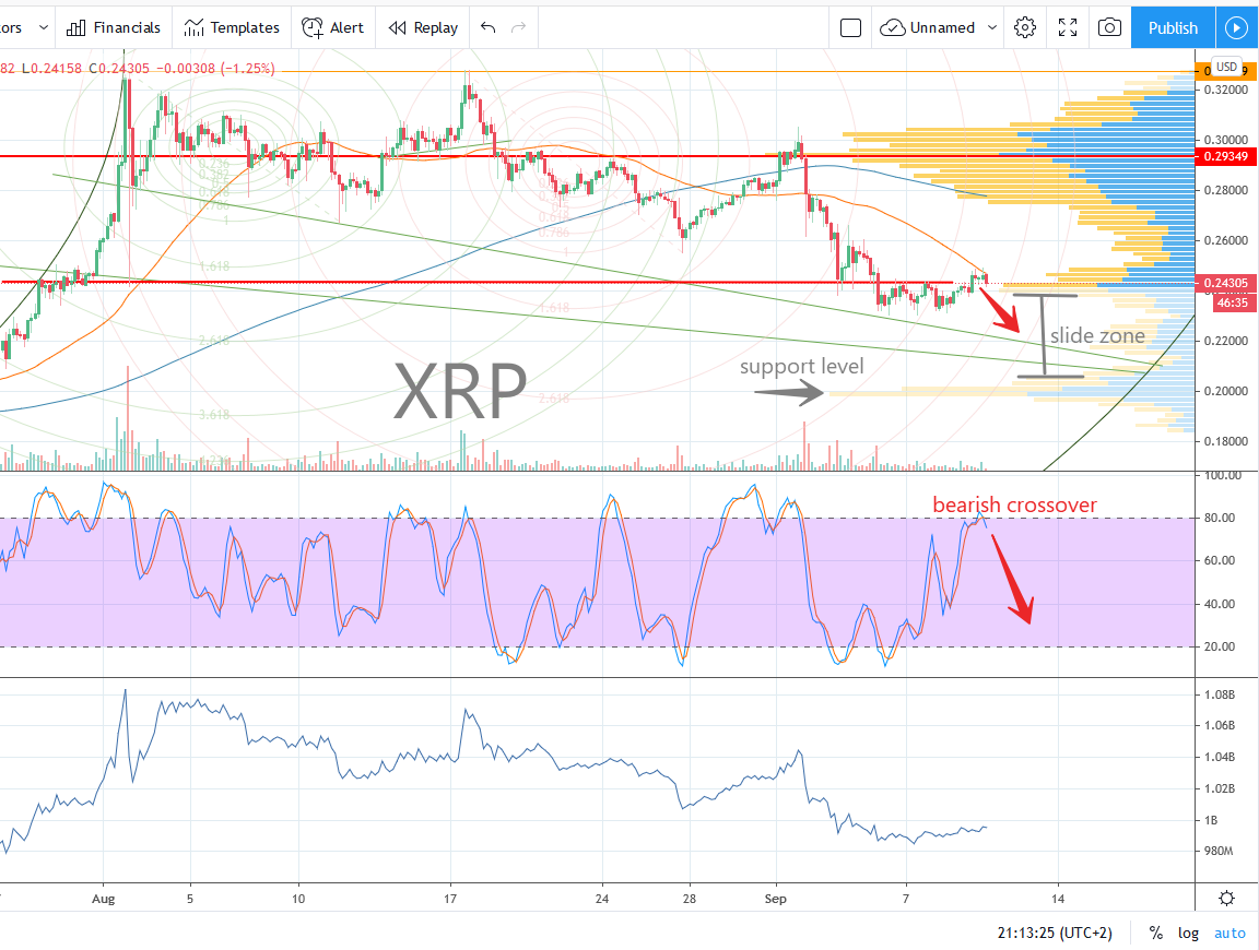
This is the most simple technical analysis we need on understanding what is going on with BTC at the moment. There is no need to go overboard with complex technical indicators when Bitcoin price action shows us something as simple and significant as this.

This move, combined with the rather “sketchy” activity of Bitfinex wildly printing Tether tokens of recent, could explain why this is happening.

First, let’s look at the critical move which could be a foretelling of the short term movement of Bitcoin price action…

When you draw a baseline from March 29th 2019 to June 9th, 2019, which by the way seems to be a popular baseline of analysis by many prognosticators of the day, we see that the Bitcoin price line has violated this base of support for the first time since this rally picked up a full head of steam.

We have already watched a major lower high form, along with 2 major lower lows, which is already an indication of possible trend reversal. I’ll be posting a more detailed analysis of these critical pivot points on the next post. But combining those facts with the current violation of the base leaves a clear indication that the short term bull run might be ending.

All hope is not lost, however. This current bull run has been highly suspect from the jump. Why? Because Bitcoin has NEVER cut short the standard market cycles over time, since its inception. The four phases of accumulation, consolidation, markup, and distribution have followed a steady trend of increasing in length of time to develop. This is a very normal and standard way that all markets develop.

But when the run to the all-time high in 2019 broke free from the standard cycle time and cut it short, I was suspicious. I truly believe that the run-up was fueled by the continuous “printing” of Tether by the Bitfinex Exchange, which continuously happened in large chunks of millions of Tether tokens.

This smacks of manipulation and conflict of interest. Why would the Securities Exchange Commission allow it to continue? We may never know. But what we do suspect is that Bitfinex does NOT hold a one-to-one backing of Tether tokens as they claimed when the token was first introduced into the market.

As per Bitfinex, the Tether token was introduced to allow faster movement in the market, providing a much-needed bridge between Bitcoin and other altcoins, to facilitate quicker settlement and movement in and out of fiat currency & cryptocurrencies. The concept was that every Tether token was backed by $1 in USD to provide liquidity, should a “run on the bank” (or the Tether token) occur.

But as time went on, the regulatory authorities and news reporting agencies suspected that the Tether token was not backed 100% by USD reserves. Now it is plainly obvious that it is not. What I believe is happening is that Bitfinex is “betting” on a small percentage of people cashing out their Tether tokens for USD after making trades.

In other words, when an individual cryptocurrency investor sells their Bitcoins, they are placing their bets on the majority of people holding on to their Tether tokens to trade them into altcoins, or wait for the price of Bitcoin to move rather than cashing out and converting the Tether into USD to be deposited back into their bank accounts.

This is the same game that banks play when they only hold a fraction of the amount of money from deposits of their customers. If you have $1 million in a bank account, the bank will leverage that deposit and lend it out many times over. It is a gamble, but as long as there isn’t a “run on the bank” (think Mary Poppins and the bank disaster), the bankers will make fortunes leveraging the deposits of others.

Each time Bitfinex printed millions of Tether tokens, they were able to gobble up BTC at higher-than-market prices, which could be why the price of Bitcoin rose so fast. But this scam would not be possible if Bitfinex were forced to show proof of the 1:1 backing of the Tether tokens if they were audited.

This is my theory of why Bitcoin price was driven up beyond the normal value, which had the result of spurring a run before the bear market cycle was completed. Now we are seeing the BTC price coming back down to Earth, heading towards the 100-day exponential moving average.

By the time this correction is done, we might be right back where we should be, completing the bear market cycle in the time frame that it should have run its course. Time will tell.

As always, this is not financial advice, and I am not a financial advisor. I am just the skeptical Cryptocurrency watchman, exposing the evidence of cracks in the foundation like Sherlock Holmes!

Until next time, let’s enjoy the action. More to come!

Carlton Flowers
The CryptoPro


BTC Bull Flag Confirmed, Breakout Was On-The-Money

BTC Forms Perfect Bull Flag - Breakout At Apex

Let’s look at 2 snapshots that I took over the past few days. The first was taken on May 24th, 2019 when I first notated the bull flag forming. When I took this screenshot, I figured we would have either a breakout to the positive or a dump within 3 to 5 days.

5-24-2019 BTC Flag.png

A dump would have occurred if the candles violated the lower limit of the ascending triangle, thus invalidating it. But as we see, the candles stayed true to the boundaries and allowed the price action to make it to the apex, hence the breakout.

BTC 5-27-2019 Bull Flag.png

The big question in everyone’s mind right now is, how long is this run going to last before we correct? Time will tell. My best guess is that we can plow forward to $9,000, and possibly even $11,500. But after that, I just don’t see the price holding up.

Of course BTC has made a complete fool of me for the entire month of May, with each tremendous surge after we all thought the correction HAD to come. As much as we think the correction has to take place, we get another surge. Seems like the animal refuses to be tamed.

We’ll keep our eyes on the action over the next few days, and see what happens when June 1st hits. Last year, we saw a dump as soon as the month of May was in the books. Will BTC and the Alts repeat last year’s action? Or will it surge ahead? Place your bets!

Carlton Flowers
The CryptoPro

5-26-2019 BTT Making Moves, Charting Serious Uptrend

Bit Torrent Token is On A Tear

BTT Ascention 5-26-2019.png

This is a technical analysis chart watcher’s dream. It doesn’t get any better than this. The action this past several days on Bit Torrent Token has produced one of the easiest-reading bar charts you could possibly ask for.

There are 5-straight triangular movements in a row for this bull run with the candlesticks bouncing off the 25-day moving average line, as depicted on this chart taken from Binance.

Looking at the MACD, we see a perfect oscillation from green to red as each surge and pullback cycle takes place. What I’m looking for at the end of this chart is the pullback and crossover of the MACD. When that happens, it could provide an opportunity to double-down and increase my position before the next surge.

It’s risky business, because we don’t know how long this ride is going to last. I’m just hoping we get a few more of these fantastic triangles, and I’ll try my hand at buying on the dips and selling on the peaks for a small amount of money.

With BTC surging and giving no signs of a sensible pullback, this action could continue for a few more days. Good luck if you’ve got this one, and don’t play with crypto unless you have money you’re willing to lose!

Carlton Flowers
The CryptoPro

NOT financial advise

5-10-2019 IOST Chart Looking Better Than Ever On All Levels

NO MATTER HOW YOU SLICE IT, THIS LOOKS GREAT…

IOST 1 - Year.jpg

I haven’t seen IOST chart out like this in over a year. In fact, I haven’t seen any of the alts look so good on all levels of the chart. If I had to make an educated guess, I would say that IOST is positioned quite well for the altcoin run in 2019.

I’ve been sitting on this coin since first buying a bag in 2017, before the historic BTC run to $19,000. I watched IOST spike, and fall tremendously in the bear market in 2018 and through the present time. I put IOST on the shelf, and have not thought much about it since then. But yesterday I happened to give a closer look to the price action, and this is what I observed.

For starters, let’s look at the 1-year price line. Coming down from resulting spikes during the fall from the all-time high, IOST settled into a fairly quiet period of accumulation.

IOST 2 - 3mo.jpg

The price line remained flat for better than 6 months. Then the volume spike came out of nowhere, and we wee the classic “bump” in price. This is the first clue that I look for that must precede a new bull market. Very low volume followed by a buying frenzy, bump up in price line, and a correction to levels above the accumulation base.

Moving right along, let’s zoom in closer and see what IOST looks like on the 3-month price line chart. What we see here is a definite overall trend to the positive, following the correction that came after the volume and price spike.

This is exactly what we want to see pre-bull run. If the price had corrected to a point at or below the accumulation base, I would have called this a false alarm. But there is a consistent, definite overall uptrend shown by the dashed yellow line that we can call an ascending base.

It’s even nicer to see that ending spike bouncing off of the ascending baseline. It will be a key determining factor on whether or not IOST can continue this trend. If the price line does not violate that base line, we could end up seeing a massive ascending triangle, or “pennant” formation. It’s gonna be party time if that’s what is in the cards.


IOST 3 - 1mo.jpg

Let’s zoom in even further and see what the 1-month price action shows us. For half of the month, we’ve been on that nice overall ascending trend line, ending with the bump of volume on the end of the 3-month chart that we can see a little bit closer.

Momentum up on the monthly compliments the positive momentum on the 3-month and 1-year price lines quite nicely, and you rarely ever see this.

I was so pleasantly surprised to see such a nice continuation of the evidence supporting a bullish pre-run, if that’s even a word. Some people would rather call this the “consolidation phase”, where the hike in volume comes along with a higher trading range. This chart definitely supports that assessment.

But well pound it down even closer, and see if the 7-day chart still paints a bullish trend.


IOST 4 - 7day.jpg

The 7-day price line chart is where I really start to pay attention for helping on buying and selling points. It’s really important to know if you’re at a reversal point, or still trading in an upward or downward channel before you decide to jump in and buy, or sell. Looking at the IOST 7-day chart, it’s still looking like this token is in play.

You’ve still got a clear view of that ascending baseline with a consistent trading range above it, ending on a nice note. And the volume bars coincide well with the price peaks. That’s nice.

There’s nothing worse than seeing a coin go on a run on little to no volume. That smacks of manipulation. But this chart looks like it makes sense, with the volume to price relationship.

If I wanted to buy in, or grab a few more bags of this coin, I’m looking for a swing point off the top of the recent peak with a target down on the yellow ascending baseline. Of course it’s never a guarantee for things to work out perfectly, but that’s the best way you can go about it when you’re trying to come in with the most leverage.

So let’s zoom in even further, and see how it looked for the day on the 24-hour chart, and then zone in to the 1-hour chart!

IOST 5 - 24hr.jpg

Okay, this is a gorgeous 1-day price line. Zooming in on this 24-hour view, the price action is equally impressive, bouncing along the ascending trend line. When we see a 24-hour chart like this, it makes it super easy to find a buying point. It just doesn’t get any better.

The volume bars still coincide nicely with the price peaks, and the corrections find firm support along the base line without losing ground. That’s very attractive.

Whenever you zoom in and find a sloppy chart with erratic action that doesn’t obey any trend lines, it makes it hard to settle on buying and selling points.

Taking it all the way in to the 1-hour price chart, I was shocked to see yet another beautiful work of art that would make child’s play of buying in. You’ve got a trend line that is easily depicted, and volume bars that match the surges in price. And it ends on a bullish note!

IOST 6 - 1hr.jpg

I would absolutely love it if I could find cryptos with price action charts that look like this, where it paints a clear picture all the way from the 1-year chart down to the 24-hour and even 1-hour charts. But sadly, this is a rare occurrence. I don’t know if I’ll ever even see anything like this again, so it was fun to document it for future reference.

This is what the crypto trader or HODLr has to keep their eyes peeled for when on the hunt for grabbing coins with a potentially explosive future. The charts can be very telling, and these are the patterns I watch out for.

The way I see it, you have to play it as if you could lose 100% of your money, while looking for the evidence that might give you the chance to grab something at an extremely low price that might take a moon shot in the future. That way you minimize risk, and maximize your slim chances of striking it rich.

That’s what makes crypto prospecting fun and exciting!

Carlton Flowers
The CryptoPro


2-19-2018 IOST Pennant Formation - Buying Opportunity

IOST GIVING HINTS OF NEXT BREAKOUT

2-19-18 IOST.PNG

February 19th 2018 - IOST, traded on the Binance platform, has been making moves. We had a series of triangle formations forming over the past week that have been small, but stair-stepped in an upward trend that culminated with a nice breakout.

Looking at the 2-hour candlesticks, we now see a definite pennant formation that appears to be focusing in on a breakout point. The volume has been settling down since the previous breakout, which is very indicative of this coin moving to the next level.

Take special note of the volume spike during the beginning of the larger current triangle formation. The volume has settled since then, and it looks like a quiet consolidation is taking place as it settles into a new higher base at 0.05 price per coin.

The impending breakout move could push IOST back to the 0.09 support level. This is a great entry point to jump on board during what I truly believe is a bull market. The crypto market looks to be rebounding, and if this is continues, we should see several formations and lots of action for IOST.

My goal is to sell at the next peak, and then wait for the correction and consolidation to complete and then retake my position. The next move after 0.09 could possibly be 0.15. I will be looking at the charts after this next action point takes place, and we'll see if it looks like it is possible. Keep your eyes peeled!

Carlton Flowers
CryptoPro Trader Supreme

DISCLAIMER: I am not a financial advisor. Do not buy any cryptocurrency with money you cannot afford to lose. This post is for information and entertainment purposes only. Invest responsibly.


Cryptocurrency Coin Watch - The Launch!

COIN WATCH MICRO BLOG - BACK IN ACTION

Coin Watch Mini Blog.jpg

Announcement! I am back into the technical analysis trading game! Back in 2013, I got back into penny stocks and started the "Stock Watcher" micro blog for trading penny stocks that were in play. But I got super busy with my businesses, and had to step away from it.

In 2017, I discovered the cryptocurrency market, and how similar it is to the OTCBB and trading penny stocks. The great thing is, just about all of the same technical indicators and chart patterns work for crytpo coins just like they did for the penny stocks.

I've decided to re-launch the mini blog and rename it to the "Coin Watch" blog. I'll be posting my trading ideas and chart updates to help those of you who trade cryptocurrencies to take advantage of this wild market.

I will still give general updates about the current state of the market over on the main crypto mini blog, but this will be for those of you who want to learn more about active trading. It goes without saying, I am NOT a financial advisor, and trading on the cryptocurrency market is EXTREMELY risky. The market is very volatile, so if you don't like wild roller coaster rides, think twice before you ever hit that "buy" button based on one of my recommendations.

Don't forget about the Crypto Resource Page with all of the links to my favorite cryptocurrency resources. I will keep that updated as time goes on.

Stay tuned and please post your comments and questions!

Carlton Flowers
CrytpoPro Supreme